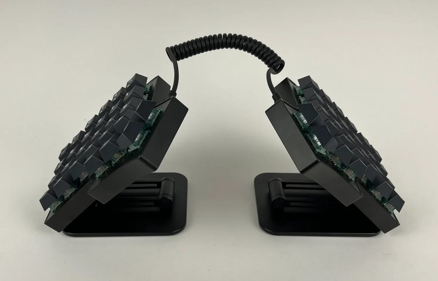
Improving my Iris keyboard
Swapping plate, switches and keycaps
Watch video on: Odysee, Youtube
Contents
Specs
Why a mechanical keyboard?
Ortholinear layout
Switches
Switch plate
Keycaps
Comparison with Dygma’s Defy
Accessories
Configuring
Verdict
Seller: Keebio (US$434 + shipping)
Specs: Iris AE Aluminium
Top and Bottom parts of case
Switch plates (FR4 and Stainless Steel)
SKUF silicone feet
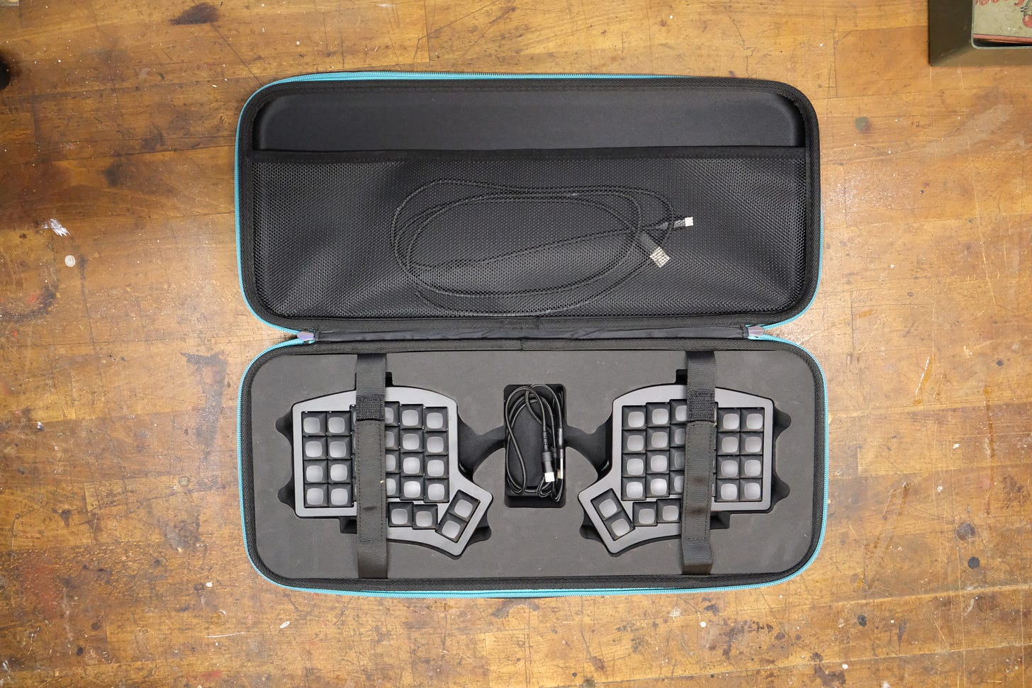
Carrying case (only with the aluminium iris)
[PCB is ordered separately]
M2 and M3 Screws (requires allan key)
O-rings for burger mount
Documentation: Iris Aluminum Case Build Guide
Why a mechanical keyboard?
From a reddit thread on Emacs:
“Using the mouse forces my hands off the home row, forces my eyes off my cursor (to the target of a gesture). The mouse and all its control-theory ephemera are a source of sheer agony. They cause me to hate my computer and to tire quickly from any use of it. … There is a special ring in Dante's inferno for the inventor of the mouse and for the legions of GUI designers [who] built all the World's software around it.”
How to understand this point-of-view
a move to Linux, ultimately, is a move away from the graphical user interface (GUI)
away from a mouse pointer that impedes your view of the text and triggers anxious tooltips and hover cards
and superfluous menus and prompts and notifications - useless distractions designed to coddle, steal your attention and break your flow
and towards simplicity and the terminal and control of your system
the keyboard becomes central
Reasons to use a mechanical split keyboard
ergonomics
possibility of tenting
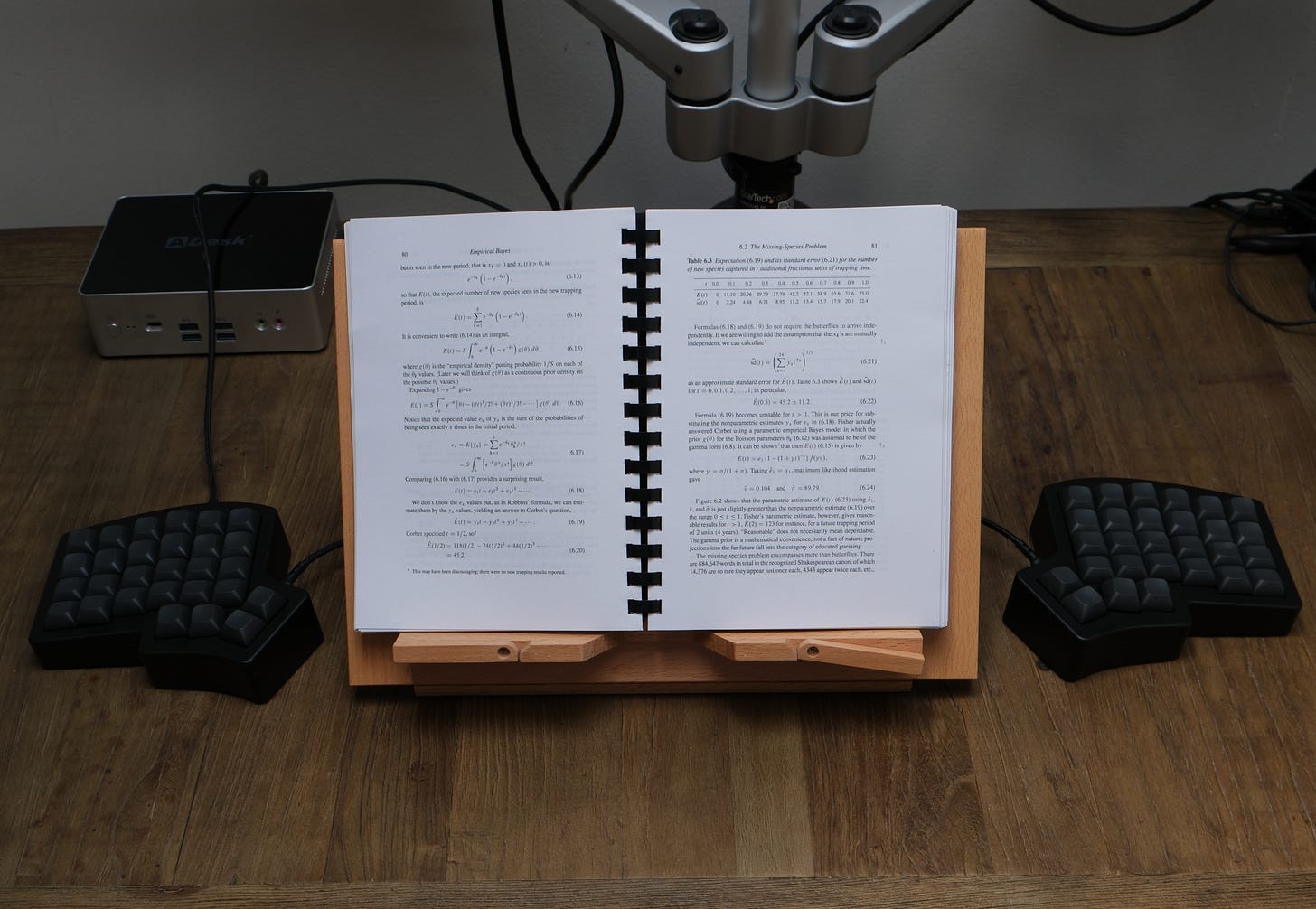
enough space to place a book or laptop
better posture for back and shoulders
a regular keyboard takes up a lot of space with wasted keys
if it includes a number pad then the keyboard is off-centre and pushes the mouse out to the side
a split keyboard has a cluster of keys for the thumb
instead of a physical, dedicated space for arrow and fn keys they can be placed on a 2nd layer accessible from the thumb cluster
a regular programmable keyboard (e.g Keychron) will allow layers but without the thumb cluster to access them it’s impractical
it is typical to allocate modifier keys found on the periphery (and thus struck with the weaker pinky finger) to the thumb cluster for easier access
e.g. ctrl and alt keys which get a lot of use in Vim; and other keys such as esc and backspace
personalise the board
change switches and keycaps for a different feel
easily take it apart to clean or lube switches
take it apart to inspect a problem (e.g. keystroke not registering)
change the layout; add key combinations and macros
escape the mouse
mouse movements could be placed on another layer to scroll webpages with Vim-like keybindings
thus, your fingers do not leave the keyboard and your eyes do not leave the display
Ortholinear layout
Iris is a split keyboard with an ortholinear layout; it is intended for those who touch-type, e.g. programmers and writers
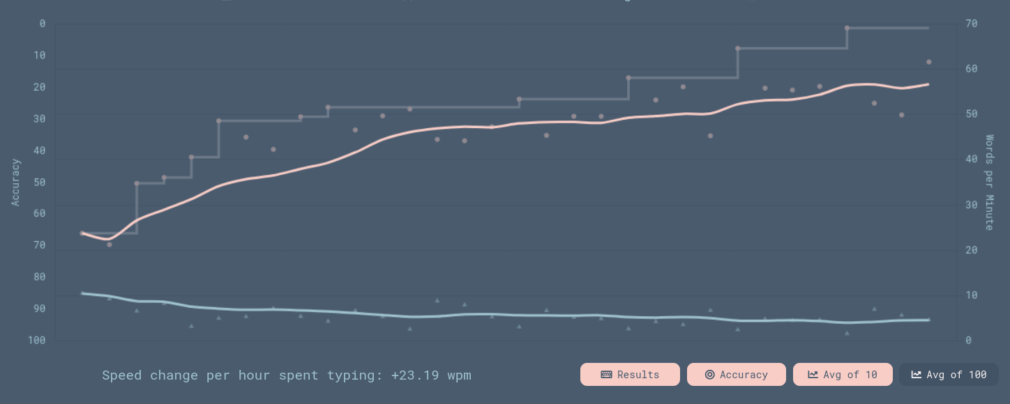
learning to touch-type can take several months of daily practice; try sites like monkeytype.com and typeracer.com
compare the Iris layout with other split keyboards here: compare.splitkb.com
the primary motivation for the ortho layout is egonomics; there may be an incidental increase in typing speed
if you can touch-type on a keyboard with a staggered layout, it is quick to adjust to the ortho layout, i.e. a couple hours of practice
Switches
Original: Cherry Pink, Linear Switch; ‘quiet’ version of the red linear switch
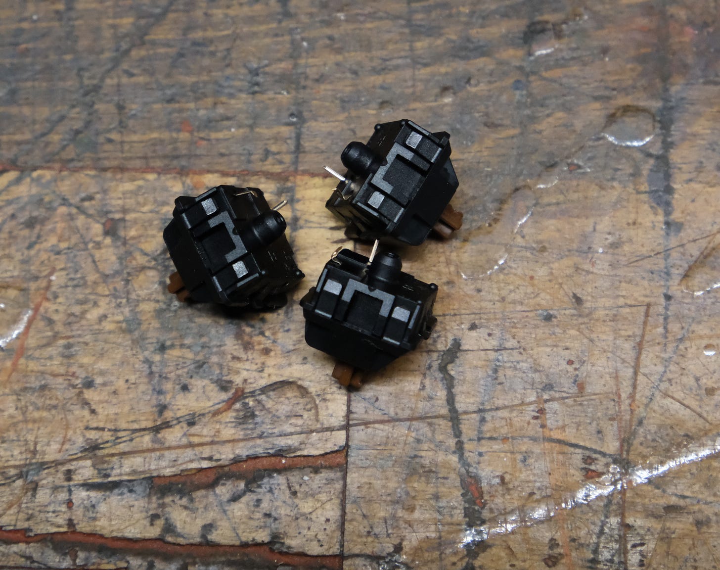
Replacement: Cherry MX2A Brown 55g Tactile Switch (3 pins), sold by mechanicalkeyboards.com (UK)
Reasons to change switches
inadvertent key presses seem more likely with linear switches
e.g., if leaning on the home row dd can delete a row in Vim (consider remapping dd to D)
the MX2A are a new switch and “represent more premium, expensive options alongside the original MX series“
tactile (Brown) switches give a familiar feel and may reduce accidental key presses
not all tactile switches are favourable
we wouldn’t recommend the sunflowers sold by Keebio: “the force needed to actuate is so much that the landing becomes very harsh“
be careful to check the pins; a lot of the switches we received had bent pins (as seen in the video)
inserting bent pins “can push the socket off of the PCB and damage it“
Switch plate
Original: Stainless steel
Replacement: FR4
Reasons to change the switch plate
from the documentation:
“The stainless steel plates are heavier and stiffer, which provide a sturdy but stiffer feel.”
“The FR4 plates are lighter and have more flex, which can provide a more bouncier feel“
both plates are provided by Keebio when ordering the Iris
switches are difficult to remove from the steel plate (as seen in the video); and can be removed with ease from the FR4 plate
we want to remove switches quickly and frequently, e.g. to clean the board
the FR4 plate is preferable because it is easier to work with in this regard
Keycaps
Original: Filco Chocolate MINILA, ABS double-shot, sold by mechanicalkeyboards.com
Replacement: GMK MTNU Graphite, PBT double-shot; design by Matt3o; sold by Oblotzky Industries: euros135.50 + shipping
Reasons to change keycaps
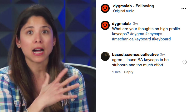
high-profile keycaps (e.g. SA) may be appealing
easily striking the tall number keys and [,] for Vim movements
but: the SA keycaps were stubborn and had a glossy feel; they were horrible to type on
“PBT plastic is less common but is usually higher quality than ABS. ABS keycaps feel smooth and develop a greasy shine over time, while PBT keycaps feel textured and are more durable.“
Ways to avoid ABS shine: “If there was a way to prevent or undo ABS shine, it would definitely be common knowledge already. Just buy PBT.“
with ABS there’s more friction and fingers don’t glide over the keycaps
MTNU keycaps are effortless; Matt3o presents his design here: MTNU, the definitive guide
at 31m0s: “SA is the weirdo … Ergonomically speaking, it doesn’t make any sense“
at 9m0s: Matt3o defends the PBT plastic
keycaps are expensive, but the result is a new board with a completely different feel
more comfortable; faster typing and fewer typos
the keycaps are lighter and sound better
MTNU is named after MT3 - Matt3o’s higher-profile, preceding design (MT new = MTNU)
we ordered MT3 from Drop but they ‘disappeared’ during shipping; only Drop sell them and we gave up
blank keycaps make sense
what the key does depends on the layer
if you can touch-type you are not looking at the keys
Comparison with Dygma’s Defy
alternatives to the Iris include
Advantage360; a clumsy, archaic board made popular by Primeagen
self-builds: Killer Whale (with a track ball); ergodash
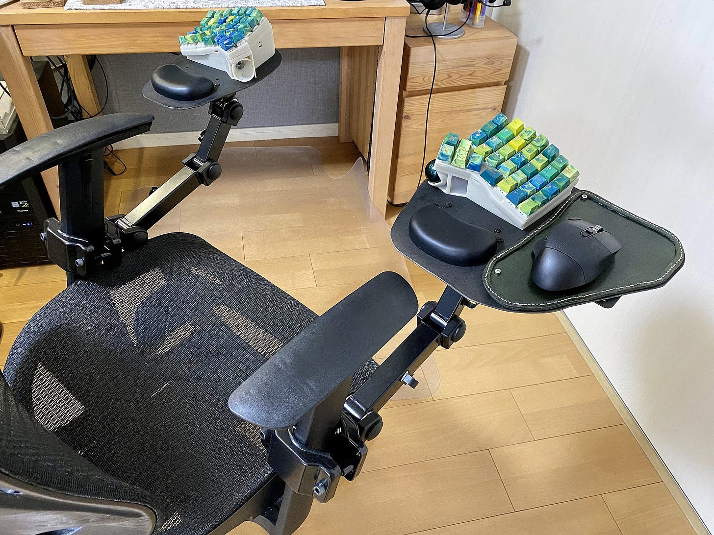
the Defy (pictured below); this is the main alternative; based on experience we note the following issues
the low-profile keycaps on the thumb cluster are bespoke and susceptible to breaking
the thumb cluster will take a beating and the low-profile caps are not as tough as one would hope
you may not have spare low-profile switches lying around; and certainly won’t have spare keycaps for this thumb cluster
other keycaps on the board are OEM profile and may not be preferrable
OEM is good for beginners: it’s easy for the fingers to find the home row
the Iris allows us to source keycaps elsewhere
there are too many keys, e.g. on the thumb cluster, although the design is rational
Dygma made an interesting video on this but failed to include Iris in their discussion
at 7m30s they suggest the user has freedom-of-choice if there are more keys on the thumb cluster and the lower keys are ‘secondary’
this may not gel with the Linux crowd who have a hankering for simplicity and parsimony
if you use 2 additional layers to the main layer then a cluster of 4 keys is sufficient (see Configuring below)
the extra inner and outer columns seem superfluous and they note this
the Moonlander has the same problem; unlike Dygma they offer key covers to hide the unused keys
although VIA is fine (see Configuring below), Dygma’s Bazecor is superior
Dygma are unencumbered by previous designs; we can follow their logic, but we are accustomed to the Iris
the Defy broadens appeal and gives new users leeway
they are right: the upper key on the Iris thumb cluster seems awkward at first
a high-profile keycap could be placed here and you get used to it
Accessories
possible wrist rests: Crystals Gel Flexible Wrist Rest x2, sold by splitkb.com (Netherlands)
we found wrist rests are not needed
possible track ball: ploopy nano, shown here with an Iris
order a USB-C cable (from Keebio) long enough to keep the splits shoulder width apart, e.g. 1m
Keebio provide a solid carry case but the weighty, expensive AE is not a keyboard for the office
the low-profile Iris (LM) is small and light enough for the commute to the office
if tactile switches are too noisy consider dampeners; they are not an ideal solution however, and are typically avoided
the tiny o-rings are easily lost (as seen in the video)
Keebio can provide replacements if you email them and make a custom payment; but o-rings are not essential, they provide some bounce (as per Keebio’s video)
Keebio now offer a magnetic tenting kit
the Iris AE has some tenting in the design
Configuring
see the VIA Usage Guide (Keebio have great documentation)
VIA is open-source; download version 3.0.0 from github
the screenshots below show how we configured our board
we use MO to move between layers; from the documentation, MO(layer #) “momentarily activates [layer #] while … holding down the key. Once released, the keyboard goes back to [layer 0]“
in Via you can save the current layout; our layout can be downloaded from our github: gist.github.com/BasedScience
we could easily add symbols for writing in multiple languages too
it is quite common to put arrows on another layer: “I mapped the Vim navigation keys to the arrow keys“
with smaller keyboards like the Kyria you would map the number keys to the home row; others want to put modifiers here, i.e.: homerow mods
why place mouse movements on a layer?
unfortunately some clients force us to use a Windows machine; this is also why we add arrow keys to the 2nd layer, e.g. for moving around spreadsheets
quickly shove the mouse pointer out of the way without moving hands off the keyboard
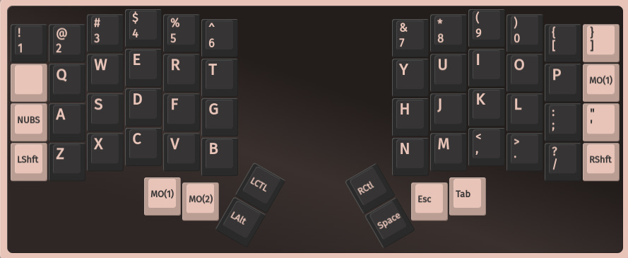
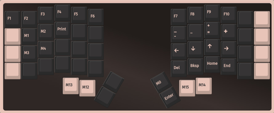
the following clip shows the finger placement for selecting text using mouse movements
the left pinky holds the shift key; the left thumb moves the keyboard to Layer 2; the right pointer finger starts the text selection while the ring finger drags the mouse pointer to select the text
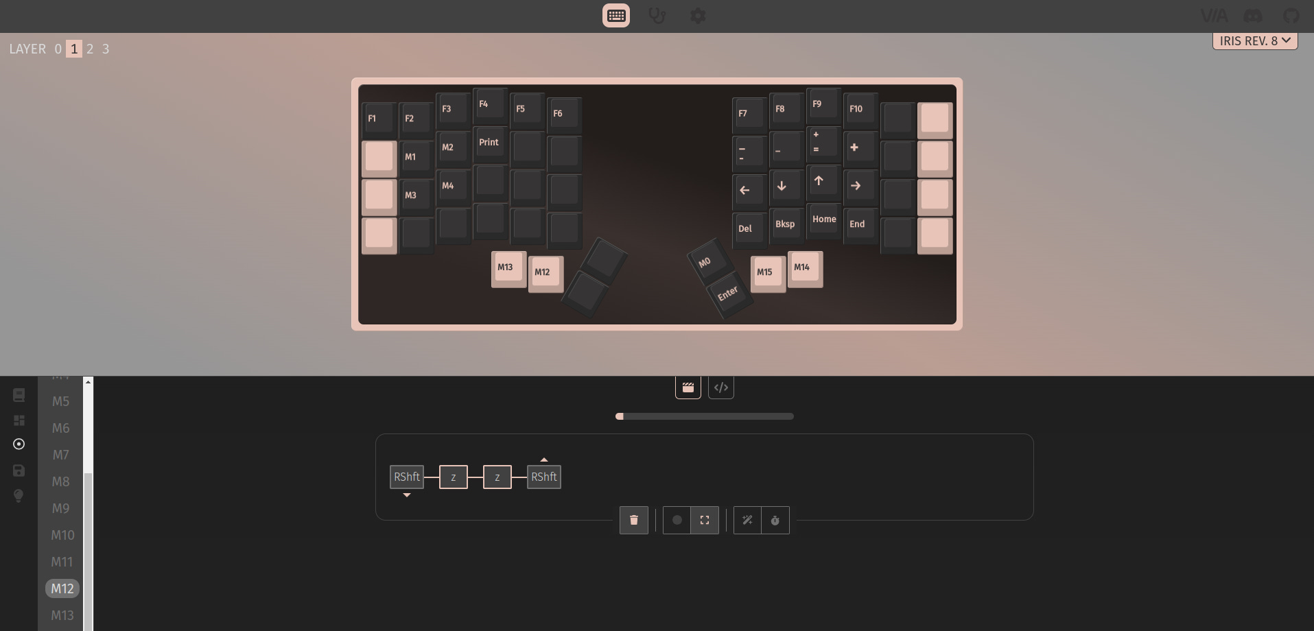
macros are useful for difficult key combinations and frequent actions
to archive an email in Outlook the shortcut is ctrl-shift-v; this is a frequent action and the key combination is awkward; thus it could be achieved with a macro
Verdict
In general, it is worth paying more if you have the money. You will spend more moving incrementally forward from a budget keyboard to a split keyboard - a likely destination.
The extra weight of the AE (aluminium edition) prevents the board from shifting on the desk, and we cannot overstate the difference good keycaps make: if you do not like the Iris it might be the keycaps and not the Iris.
The Iris simplifies issues. E.g., the ANSI versus ISO discussion is redundant; the virtues of a dedicated number pad or trackball are an aside; and RGB lighting is unnecessary: if you can touch-type you do not need to see the keys in the dark (thus it is not added to our configuration above).
Forget the old technique of palming ctrl keys; or reaching for the <esc> key in the top left everytime you jump to normal mode in Vim; and discussions about how to hit modifier keys when touch typing. And the obligatory remapping of the capslock key (a large piece of real estate for a useless key) to a ctrl key. Forget all such nonsense.
If this post seems too opinionated, try the geekhack forum for good, honest opinion, e.g.: Split and ortholinear did nothing for my RSI. There is some research on the topic, e.g. Effect of setup configurations of split computer keyboards on wrist angle. Xah Lee goes deep too.


